
Cross-sectoral

Belgian final energy consumption
Each of our three scenarios features its own storyline with shared parametric assumptions. The common theme across all of them is that the TIMES-Be model aims for net-zero carbon emissions in Belgium by 2050. As a result, there are common trends in the cost-optimal technology choices, alongside scenario-specific variations.
A broad overview of the final energy consumption graph reveals a reduction of at least 30% in final energy consumption from 2025 to 2050. The most notable changes include a more than 90% increase in electricity consumption and a reduction of at least 80% in fossil fuel consumption. Biomass consumption more than doubles when allowed, while the use of blended biofuels declines sharply. The direct use of heat, via heat networks, increases by a factor of 2.5 from 2025 to 2050.
With this general backdrop in mind, let’s dive deeper and explore the differences in the results across our three scenario analyses.
KEY TAKEAWAYS
-
By 2050, final energy demand decreases by a
third
regardless of the scenario

-
By 2050
80%
reduction in fossil fuel consumption

-
By 2050, electricity demand
doubles
in the 3 scenarios

ROTORS final energy consumption
The ROTORS scenario is characterized by the highest levels of electricity consumption and the lowest fossil fuel use by 2050.
The additional capacity from offshore and onshore wind intermittently supplies electricity at a lower cost than in the REACTORS and IMPORTS scenarios. This results in more than a doubling of electricity consumption by 2050, with electricity use nearly 5% higher than in the other scenarios.
Fossil fuel consumption drops by 85% between 2025 and 2050. The most significant reductions come from the near-total phaseout of gas and diesel oil from the energy mix, along with an 80% decrease in natural gas use. The remaining natural gas consumption is much lower than in the other scenarios, due to the limited access to carbon storage in ROTORS.
This scenario clearly illustrates the impact of a sustained effort to plan, permit, and develop renewable energy sources within the Belgian context.
REACTORS final energy consumption
The REACTORS scenario is marked by high electricity consumption and low fossil fuel use by 2050, striking a balance between the ROTORS and IMPORTS scenarios.
The availability of additional dispatchable nuclear capacity provides electricity at a stable cost with a degree of flexibility. This results in a 98% increase in electricity consumption by 2050—higher than in the IMPORTS scenario, but lower than in ROTORS .
Fossil fuel consumption decreases by 83% between 2025 and 2050. The most notable reductions are the near-total phase-out of gas and diesel oil from the energy mix, along with a 71% reduction in natural gas consumption. The remaining natural gas use falls between the levels seen in the other two scenarios. By its input assumptions the REACTORS scenario features the lowest solid biomass consumption.
This scenario highlights the role of dispatchable nuclear energy in supporting electrification, while ensuring a reliable energy supply during periods of low renewable generation.
IMPORTS final energy consumption
The IMPORTS scenario is characterized by high electricity consumption and low fossil fuel use in 2050. Among the three scenarios, it demonstrates the least pronounced shift from fossil fuels to electricity—though electrification remains significant by 2050.
The availability of clean molecules for import, albeit at a substantial cost, allows for flexible but relatively expensive electrification. This results in a 93% increase in electricity consumption by 2050, placing it behind the other two scenarios.
Fossil fuel consumption declines by 81% from 2025 to 2050. The most notable reductions include the near-total phase-out of gas and diesel oil from the fuel mix, along with a 67% decrease in natural gas use. The remaining natural gas consumption is the highest among the three scenarios—approximately 70% higher than in the ROTORS scenario.
This scenario illustrates the impact of relying on higher levels of imported electricity and clean molecules to support the energy transition.
Belgian CO2 emissions
A shared parametric assumption across all three scenarios is the goal of achieving close to net-zero carbon emissions in Belgium by 2050. The CO₂ results presented here reflect three distinct pathways toward carbon neutrality; however, they are not forecasts suggesting that current policies and measures will necessarily achieve this target. It’s also important to note that the term net-zero carbon emissions used on this platform does not imply absolute zero emissions by 2050. In each scenario, despite fossil fuel phaseout, electrification, and the adoption of clean molecules, a residual 2 million tonnes of CO₂ remains.
The reason for this? Certain hard-to-abate processes still emit limited amounts of CO₂. As such, it’s important to keep in mind this margin of flexibility: that remaining 2 million tonnes will need to be removed from the atmosphere through other means, such as BioEnergy with Carbon Capture and Storage (BECCS) or Direct Air Capture (DAC), either within Belgium or abroad.
When it comes to CO₂ emissions, all three scenarios share a common pattern. We differentiate between CO2 reductions originating from technology and process changes (mitigation) and end-of-pipe carbon capture technology. The scenarios underscore the need for strong mitigation of combustion-related emissions, moderate mitigation of process-related emissions, and a clear requirement for carbon capture and storage technologies.
With that in mind, let’s now take a closer look at what each scenario reveals about CO₂ emissions specifically.
KEY TAKEAWAYS
-
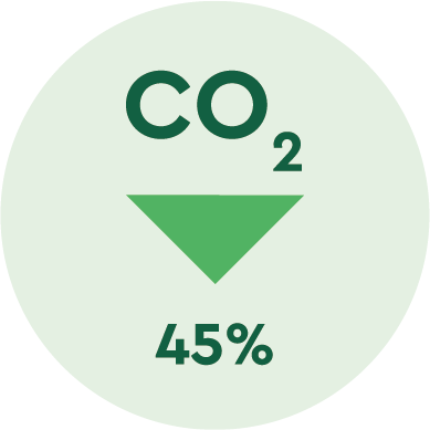
By 2030, Belgian CO2 emissions are reduced by
45%
compared to 1990 levels
-
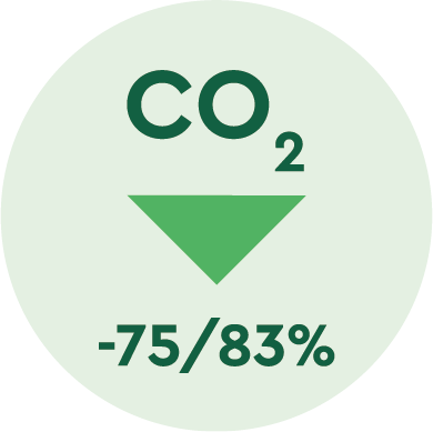
By 2040, a CO2 reduction of
75-83%
should be met to be on track for net-zero by 2050
-
By 2040, up to
20 Mton CO2
from industry is captured and stored
ROTORS CO2 emissions
The ROTORS scenario results in the lowest levels of CO₂ emissions—both from combustion and industrial processes. This outcome is a direct result of the scenario design, which imposes a cap of 10 million tonnes of CO₂ stored per year. It’s important to note that the total amount of CO₂ captured is actually higher, due to the reuse of captured carbon, which does not count toward the storage cap.
Combustion-related CO₂ emissions begin to decline as early as 2030 and continue on a downward path, reaching an 88% reduction by 2050 compared to 2025 levels. In contrast, process-related CO₂ emissions only begin to decrease after 2040, suggesting that mitigation costs are significantly higher and/or that suitable technologies only become viable later in the timeline. By 2050, nearly 33% of process emissions are mitigated. CO₂ capture begins around 2030, steadily increases by 2040, and then accelerates sharply toward 2050.
The ROTORS scenario follows a clear sequence in its decarbonization strategy—beginning with combustion emission reductions, moving through CO₂ capture, and culminating in the mitigation of process emissions.
REACTORS CO2 emissions
The REACTORS scenario closely resembles the IMPORTS scenario in terms of emission patterns. Levels of combustion CO₂, process CO₂, and CO₂ capture are all higher than in the ROTORS scenario.
Combustion-related CO₂ emissions begin to decline as early as 2030, continuing steadily downward to reach an 85% reduction by 2050 compared to 2025 levels. Process-related CO₂ emissions, however, only show a slight decrease after 2040—suggesting higher mitigation costs and/or delayed availability of alternative technologies. By 2050, only 10% of process emissions are mitigated. CO₂ capture starts around 2030 and rapidly scales up, reaching full acceleration by 2040.
Like ROTORS, the REACTORS scenario follows a distinct sequence of abatement strategies: beginning with combustion emission reductions, progressing through CO₂ capture, and ending with limited mitigation of process emissions. However, the higher permitted level of CO₂ capture in this scenario reduces the pressure to mitigate process emissions, resulting in lower levels of process CO₂ abatement compared to ROTORS.
IMPORTS CO2 emissions
The IMPORTS scenario resembles the REACTORS scenario in terms of emissions. Levels of combustion CO₂, process CO₂, and CO₂ capture are all higher than in the ROTORS scenario.
Combustion-related CO₂ emissions begin to decline as early as 2030 and continue their downward trajectory, reaching an 85% reduction by 2050 compared to 2025 levels. Process-related CO₂ emissions show only a modest decline after 2040, suggesting that mitigation remains costly and/or that viable alternatives reach maturity later in the timeline. By 2050, just 10% of process emissions are mitigated. CO₂ capture starts in 2030 and rapidly accelerates, reaching full deployment by 2040.
As with the REACTORS scenario, the IMPORTS pathway follows a clear sequence in its abatement strategy: starting with combustion emission reductions, scaling up CO₂ capture, and ending with minimal mitigation of process emissions. The higher allowance for CO₂ capture, relative to the ROTORS scenario, results in less emphasis on reducing process CO₂ emissions.
CO2 emissions
per Type
per Sector
Annual cost
We all know there’s no such thing as a free lunch, and the same goes for the energy transition. Making Belgium almost carbon-neutral by 2050 will require major investments across all sectors in clean, climate-friendly technologies. This transition comes with a cost, but it also brings opportunities.
In the chart below, we show how the total yearly cost of running a decarbonised energy system in 2050 is made up of three key parts:
Yearly capacity related expenses: This includes the annual repayments (annuities) on large upfront investments in new energy infrastructure, plus fixed costs for operating and maintaining that infrastructure.
Yearly operating expenses - net import: These are the costs of importing energy (like electricity or clean fuels), minus any income from energy exports.
Yearly operating expenses - other: This covers the day-to-day costs of running the system, expenses due for the variable operating and maintenance cost.
The length of each bar in the graph shows the total amount spent each year, in millions of euros. The percentages within the bars show how each scenario compares to a reference scenario, which you can choose by clicking on any bar.
It’s important to note that doing nothing also comes at a cost. Even without decarbonising, old energy systems need to be replaced over time. The point of the graph is not to say whether the energy transition costs more or less than doing nothing—but to compare how the total costs and their breakdown differ across the three scenarios.
When we compare the scenarios:
REACTORS and ROTORS (which rely more on local nuclear and wind power) are more capital-intensive, meaning more of their cost goes into building energy infrastructure. But because they rely less on fuel imports, they are less exposed to volatile international energy prices.
The IMPORTS scenario leads to higher operating expenses as it depends more on bringing in clean fuels and electricity from abroad. If those imports remain cheap, this scenario could be the most affordable option. But if prices rise or supplies become unreliable—and if we haven’t invested in local alternatives—this option could end up being much more expensive. To show this risk, we included a version of the Imports scenario using the same prices as in the other scenarios (Imports High Cost).
So, what’s the takeaway? Investing in local energy sources like wind and nuclear can reduce our dependence on international markets, lower price uncertainty, and keep overall costs more stable.
Finally, it’s worth noting what’s not included in these numbers. The costs shown are purely financial and directly related to the energy system. They don’t account for:
Environmental benefits like cleaner air
Potential fines for missing climate targets
Damages from further global warming
Impacts on jobs, GDP, subsidies, or taxes
These factors matter too, but this chart focuses solely on comparing the direct financial costs of different paths to a low-carbon future.